Making rounded corner buttons are the new trend in web and mobile design due to their modern and inviting appearance. The smooth edges of these buttons add a touch of elegance to the interface, making it more appealing and user-friendly.
Studies have revealed that this design element positively impacts user engagement and experience. Furthermore, it helps the buttons to stand out from other elements on the page, making them easier to locate and click.
This feature is particularly important for mobile users, where the screen is smaller and the risk of accidentally clicking on other elements is high.
Today, I will share a tutorial on easy steps to make a rounded corner button in Flutter. By following a few simple steps, you can easily make a rounded elevated button in Flutter.
Which widgets are available in Flutter?
| Old Widgets | New Widgets |
| FlatButton | TextButton |
| RaisedButton | ElevatedButton |
| OutlineButton | OutlinedButton |
You can read more about buttons here.
New changes
Flutter buttons have recently undergone some changes. Now, you can customize the shape and style of your buttons. This allows for greater flexibility and creativity when designing your button.
| Property | Property Type |
| style | ButtonStyle |
| shape | MaterialStateProperty<T> |
style property is the same for all button types, which accept the ButtonStyle types. You can read about the ButtonStyle here.
Different Types of Border
There are multiple constructors for shape properties such as RoundedRectangleBorder, CircleBorder, BeveledRectangleBorder, ContinuousRectangleBorder, StadiumBorder, and StarBorder.
I am going to give you all ShapeBorders examples. We will use only the elevated button because these properties will equal all other buttons’ shape properties.
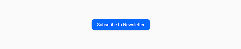
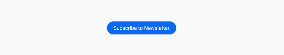
1) RoundedRectangleBorder – Recommended
Copy and paste this Widget method into your code and call it. Make some changes and play with it.
Here, a border radius has been applied to round the borders. While this method is effective, it’s worth exploring other ShapeBorder classes, as they may use in the flutter journey.
Widget roundedRectangleButton() {
  return ElevatedButton(
    onPressed: () {
      print("Thanks to visit IntendStuff");
    },
    style: ElevatedButton.styleFrom(
      padding: const EdgeInsets.all(17),
      backgroundColor: const Color(0xFF0669FF),
      shape: RoundedRectangleBorder(
        borderRadius: BorderRadius.circular(10),
      ),
    ),
    child: const Text("Subscribe to Newsletter"),
  );
}
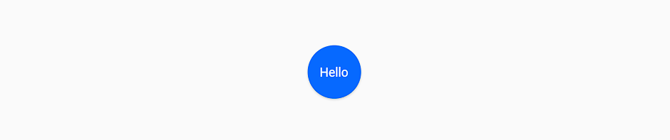
2) CircleBorder
Widget circleButton() {
  return ElevatedButton(
    onPressed: () {
      print("Thanks to visit IntendStuff");
    },
    style: ElevatedButton.styleFrom(
      padding: const EdgeInsets.all(30),
      backgroundColor: const Color(0xFF0669FF),
      shape: const CircleBorder(),
    ),
    child: const Text("Hello"),
  );
}
3) BeveledRectangleBorder
Widget beveledRectangleButton() {
  return ElevatedButton(
    onPressed: () {
      print("Thanks to visit IntendStuff");
    },
    style: ElevatedButton.styleFrom(
      padding: const EdgeInsets.all(17),
      backgroundColor: const Color(0xFF0669FF),
      shape: BeveledRectangleBorder(
        borderRadius: BorderRadius.circular(10),
      ),
    ),
    child: const Text("Subscribe to Newsletter"),
  );
}
4) ContinuousRectangleBorder
Widget continuousRectangleButton() {
  return ElevatedButton(
    onPressed: () {
      print("Thanks to visit IntendStuff");
    },
    style: ElevatedButton.styleFrom(
      padding: const EdgeInsets.all(17),
      backgroundColor: const Color(0xFF0669FF),
      shape: ContinuousRectangleBorder(
        borderRadius: BorderRadius.circular(10),
      ),
    ),
    child: const Text("Subscribe to Newsletter"),
  );
}
Same as RoundedRectangleBorder, but with smooth transitions.
5) StadiumBorder
Widget stadiumButton() {
  return ElevatedButton(
    onPressed: () {
      print("Thanks to visit IntendStuff");
    },
    style: ElevatedButton.styleFrom(
      padding: const EdgeInsets.all(17),
      backgroundColor: const Color(0xFF0669FF),
      shape: const StadiumBorder(),
    ),
    child: const Text("Subscribe to Newsletter"),
  );
}
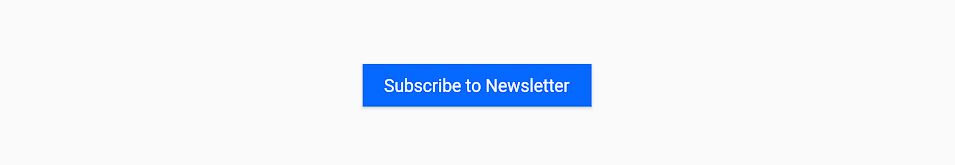
6) Rectangle Button
Widget rectangleButton() {
  return ElevatedButton(
    onPressed: () {
      print("Thanks to visit IntendStuff");
    },
    style: ElevatedButton.styleFrom(
      padding: const EdgeInsets.all(17),
      backgroundColor: const Color(0xFF0669FF),
      shape: const RoundedRectangleBorder(
        borderRadius: BorderRadius.zero,
      ),
    ),
    child: const Text("Subscribe to Newsletter"),
  );
}
Conclusion
In this article, you will find a flutter button border-radius to round the corners. The shape property can be applied to any type of button, including OutlinedButton, TextButton, and ElevatedButton.
If you like this article on How to Make Rounded Corner Button in Flutter, please consider sharing it with your fellow Flutter developers. Feel free to leave a comment below if you have any questions, and be sure to check out IntendStuff for more informative articles on Flutter.


![Perfect Solution - No Firebase App '[DEFAULT]' has been created in Flutter](/wp-content/uploads/2023/03/Perfect-Solution-No-Firebase-App-DEFAULT-has-been-created-in-Flutter-390x220.png)